Luxury Design Showroom Now Open!
Call Now
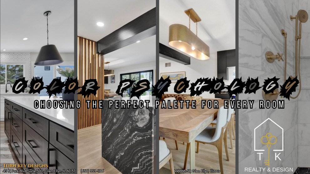
Color Psychology: Choosing the Perfect Palette for Every Room
The Importance of Color Psychology
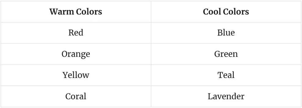
Color psychology is crucial for choosing the perfect palette for each room in your home. Different colors evoke specific emotions. For example, warm tones like red and orange create energy, while cool tones such as blue and green promote relaxation. In the living room, balance warm and cool tones for comfort. A calming palette works best in the bedroom with soft neutrals and gentle shades. For energetic spaces like a home office, a mix of bright and soothing colors can boost motivation and focus. Understanding these principles can enhance your home's atmosphere and well-being, and there's much more to explore.
- Balance warm and cool tones in living rooms to create a welcoming yet calming atmosphere through color harmony.
- Use calming neutrals and soft hues in bedrooms to promote relaxation and a soothing environment for restful sleep.
- In home offices, incorporate blues and greens for focus, and yellows for motivation to enhance productivity and creativity.
- Warm yellows and soft greens brighten kitchens, while light blues create a serene, revitalizing space for cooking and gathering.
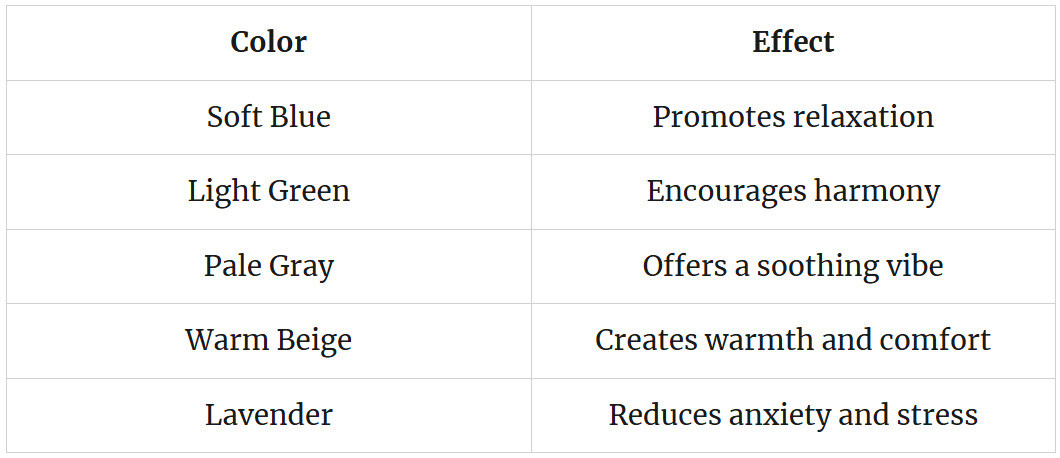
- Choose calming neutrals like soft whites and pale grays in bathrooms to evoke purity and promote relaxation in a personal retreat.
Understanding Color Psychology
In the domain of design, understanding color psychology is essential. It helps designers choose colors that not only look good but also resonate with people on a deeper level. Colors can evoke feelings and reactions, making them a powerful tool in any design project.
Different cultures have unique views on color, leading to cultural variations in how colors are perceived. For example, while white symbolizes purity in some cultures, it may represent mourning in others. Recognizing these differences is vital for effective communication through design.
At the same time, there are universal perceptions of color that tend to be widely accepted across various cultures. For instance, blue is often associated with calmness and tranquility. Designers can leverage these universal perceptions to create spaces that foster a sense of peace and comfort.
Ultimately, understanding color psychology allows designers to make informed choices. By balancing cultural variations and universal perceptions, they can create designs that not only appeal to aesthetics but also connect meaningfully with their audience. This knowledge empowers designers to craft spaces that feel inviting and true to the spirit of freedom.
The Impact of Colors on Mood
Colors frequently influence mood and emotional responses, playing a crucial role in our daily experiences. Different colors can serve as emotional triggers, evoking feelings of happiness, sadness, or calmness. For instance, warm colors like red and orange may create feelings of excitement and energy, while cool colors such as blue and green often promote relaxation and peace.
Our personal experiences with colors can shape what they mean to us. This concept is known as color memory. A person may feel joy when seeing yellow because it reminds them of sunny days, while someone else might feel discomfort due to negative associations. These unique connections can affect how we respond to colors in our environment.
Choosing the right colors for spaces we inhabit is essential. By understanding the impact colors have on mood, we can create environments that support our emotional well-being. For instance, a soothing palette in a bedroom can help promote restful sleep, while vibrant hues in a creative space might inspire innovation. Ultimately, being mindful of color choices can enhance our daily lives and support our pursuit of freedom and happiness.
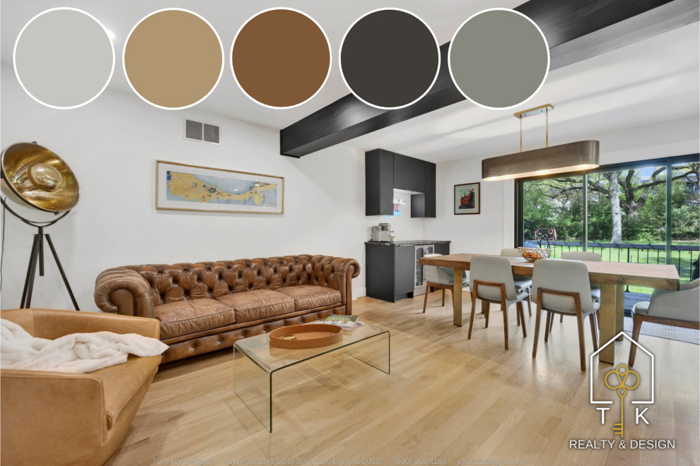
Choosing Colors for the Living Room
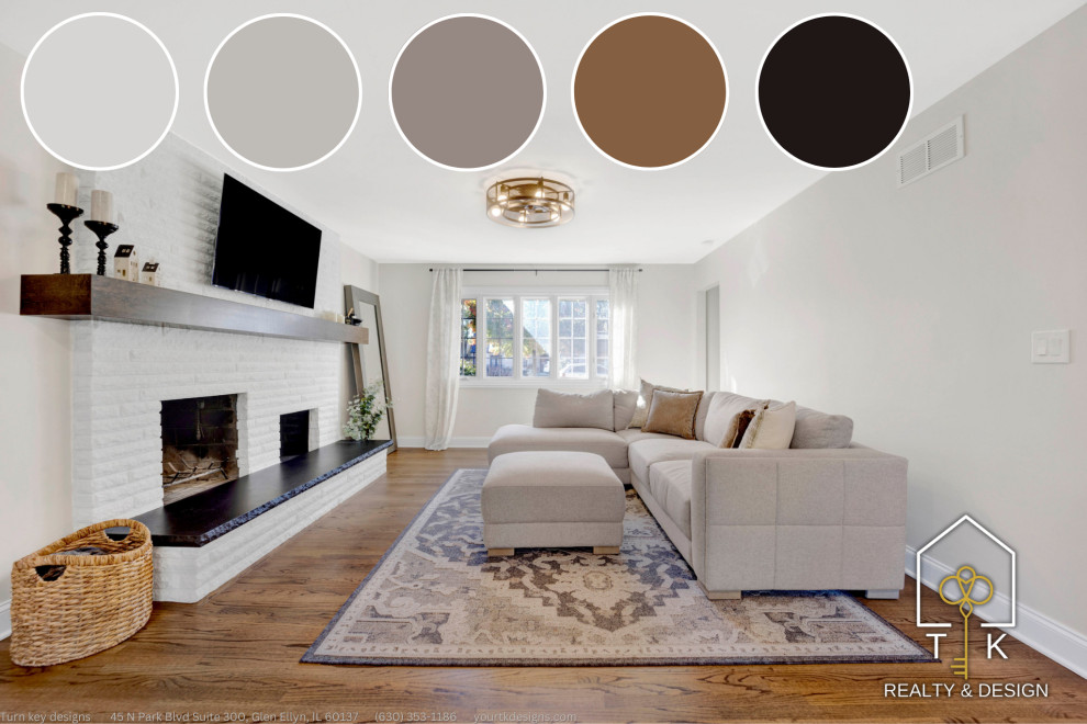
When choosing colors for the living room, it is crucial to take into account the balance between warm and cool tones. Warm tones can create a cozy atmosphere, while cool tones can promote a calm environment. Additionally, selecting the right accent colors can enhance the overall design and add visual interest.
Warm vs. Cool Tones
Selecting the right color palette for your living room can substantially impact its ambiance and overall feel. When considering warm and cool tones, it is essential to understand how they create different moods. Warm tones, such as reds, oranges, and yellows, evoke feelings of energy and comfort. They can create a cozy atmosphere, perfect for gatherings and family time. In contrast, cool tones like blues, greens, and purples offer a calm and serene vibe. These colors can help create a peaceful space for relaxation.
Achieving color harmony in your living room involves balancing these warm and cool tones. You can use tone contrast to highlight specific areas or features of the room. For instance, pairing warm accent walls with cool furnishings can create visual interest and depth. Alternatively, a mainly cool palette can be accentuated with warm accessories to provide warmth without overwhelming the space.
Ultimately, your choice between warm and cool tones should reflect your lifestyle and personal preference. The right balance can enhance your living room, making it a welcoming sanctuary for you and your guests.
Accent Colors Selection
Accent colors play a vital role in enhancing the overall design of your living room. They provide the finishing touches that can transform a space from ordinary to extraordinary. When selecting accent colors, think about the principle of color contrast. This technique allows you to create a dynamic and visually appealing environment. Additionally, reflect on cultural influences that may inspire your color choices.
Here are five impactful options to reflect on for your living room accents:
- Bold Red: Evokes passion and energy.
- Calming Blue: Promotes tranquility and relaxation.
- Vibrant Yellow: Inspires happiness and warmth.
- Earthy Green: Connects to nature and refreshes the mind.
- Elegant Purple: Suggests luxury and creativity.
These colors can be used in various ways, such as pillows, artwork, or decorative items. The right combination can help express your individuality and create a space that feels both inviting and free. Remember, the goal is to choose accent colors that resonate with you, allowing your personality to shine through in your living room.
Creating Calm in the Bedroom With Color
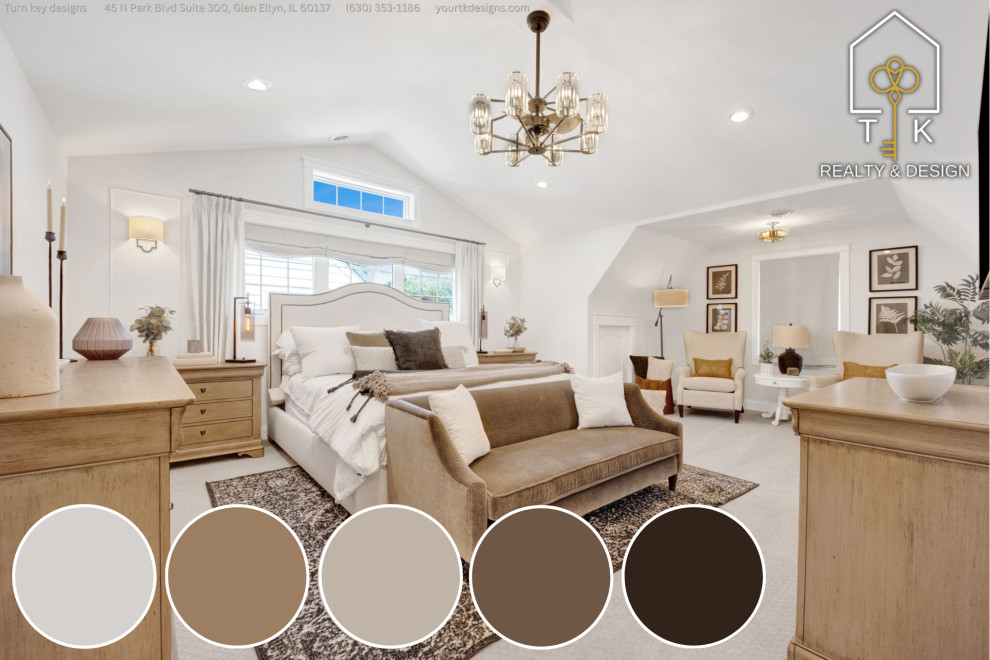
Creating a serene atmosphere in the bedroom can markedly enhance relaxation and restful sleep. The right color choices can help alleviate bedroom blues and promote tranquility. Calming neutrals, such as soft grays, gentle beiges, and muted whites, create a peaceful backdrop that encourages calmness.
To help you select the perfect palette for your bedroom, consider the following:
These colors work well together or alone, allowing you to craft a space that feels inviting and restful. Experiment with different shades to find what resonates with you. Avoiding bold, harsh colors can help keep the space serene, preventing feelings of overwhelm. By focusing on calming neutrals, you can create an environment that nurtures restful sleep and fosters a sense of freedom from the daily grind. Embrace these color choices to transform your bedroom into a sanctuary of peace.
Energizing Your Home Office
Creating an energizing home office involves selecting colors that inspire focus and creativity. A balanced mix of warm and cool tones can enhance motivation while maintaining a sense of calm. This careful choice of colors can substantially impact your productivity and overall work experience.
Colors That Inspire Focus
Often, the right color palette can substantially enhance focus and productivity in a home office. Choosing colors that inspire concentration can transform study spaces into environments that promote cognitive enhancement. Colors like blue, green, and yellow can stimulate the mind and keep distractions at bay.
Here are some colors to take into account for your home office:
- Blue: Encourages calmness and focus, perfect for deep work.
- Green: Represents balance and rejuvenation, ideal for creativity.
- Yellow: Invokes energy and optimism, great for motivation.
- Orange: Sparks enthusiasm and excitement, fueling productivity.
- White: Offers clarity and simplicity, creating an open space for thought.
Selecting the right colors can lead to a more enjoyable work experience. A well-chosen palette can help create an atmosphere that encourages freedom and independence. When your surroundings are visually inspiring, you are more likely to engage deeply with your tasks. By carefully weighing your color choices, you can craft a home office that energizes you and enhances your focus, allowing for greater success in your endeavors.
Balancing Warm and Cool
A well-balanced color palette can substantially energize your home office. Combining warm and cool tones creates tone harmony, fostering a productive environment. Warm colors like red and orange can stimulate energy, while cool colors such as blue and green promote calmness. Finding the right balance between these colors can enhance your workspace.
To help you visualize potential combinations, here is a simple guide:
Using color contrast effectively can make your office feel dynamic without overwhelming it. For example, a warm accent wall paired with cool furniture can create visual interest. Additionally, consider adding artwork that blends both tones for a cohesive look.
Ultimately, balancing warm and cool colors can energize your home office, allowing you freedom in design while maintaining focus. Embracing this color psychology can lead to a workspace that not only inspires creativity but also promotes productivity. Choose your palette wisely, and enjoy the benefits of a well-balanced environment.
Inviting Colors for the Kitchen
Choosing inviting colors for the kitchen can transform it into a warm and welcoming space. The right palette not only enhances the kitchen lighting but also sets the mood for gatherings and family meals. Current color trends suggest a shift towards softer, more comforting tones that create an inviting atmosphere.
Consider these inviting colors for your kitchen:
- Warm yellows: Brighten the space and evoke feelings of happiness.
- Soft greens: Bring nature indoors and promote calmness.
- Peachy tones: Add warmth and a touch of energy.
- Light blues: Create a serene environment while remaining revitalizing.
- Creamy whites: Offer a classic look that feels spacious and clean.
When selecting colors, think about how they interact with your kitchen lighting. Natural light can enhance softer hues, while artificial lighting may change their appearance. Embrace color trends that resonate with your style and invite freedom in your culinary space. An inviting kitchen can be a haven for creativity and connection, making it essential to choose a palette that reflects warmth and joy.
Serene Shades for the Bathroom
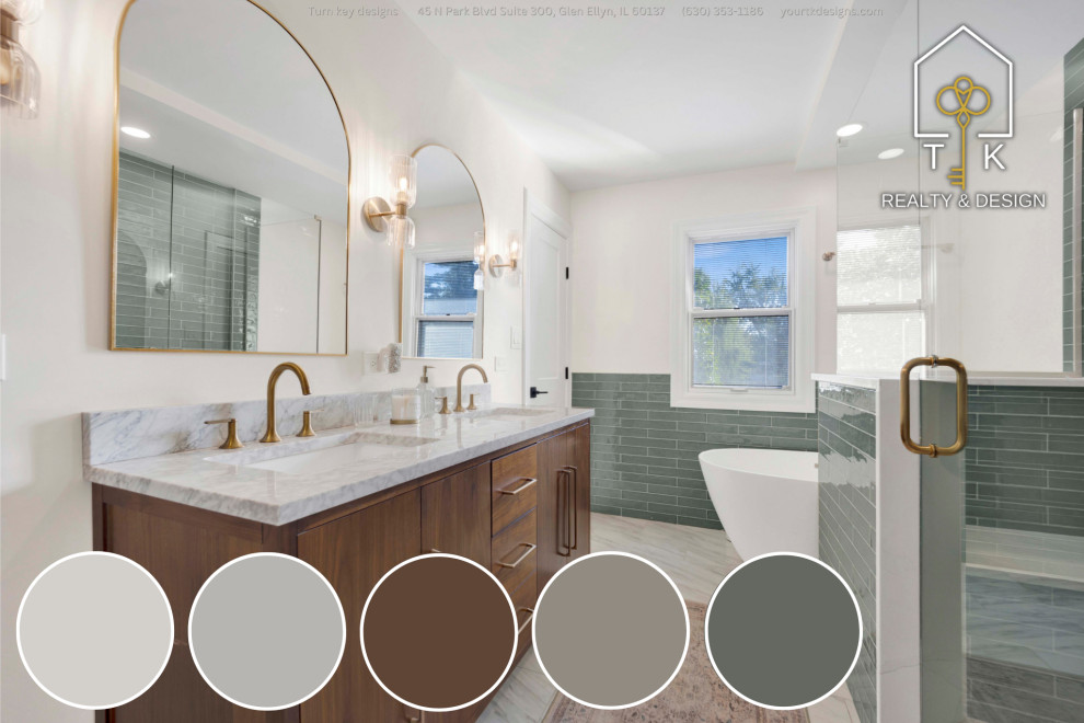
Creating a calming atmosphere in the bathroom starts with selecting the right color palette. Choosing serene shades can turn this space into a peaceful retreat. Utilizing calming neutrals such as soft whites, pale grays, and gentle beiges can promote relaxation. These colors create a sense of tranquility, allowing you to unwind after a long day.
Incorporating subtle hints of color can enhance the feel. For instance, soft blue tones can evoke the serene imagery of water, helping to wash away stress. However, be mindful of using too much of the bathroom blues, as it might create an overwhelming environment.
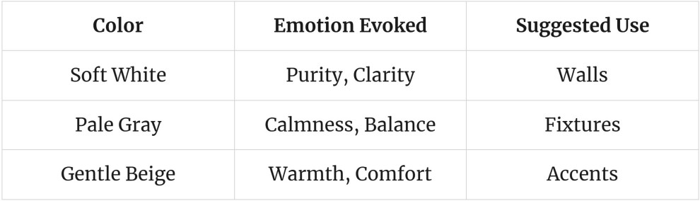
Below is a simple table to illustrate some serene shades for the bathroom:
Color Combinations to Avoid
Certain color combinations can detract from the desired atmosphere in a bathroom. It is essential to avoid specific pairings that create color clashes and lead to design mistakes. Choosing the wrong colors can create a space that feels chaotic rather than calming. Here are some combinations to steer clear of:
- Bright red and neon green: This pairing is overwhelming and aggressive.
- Dark brown and bright yellow: This combination can feel heavy and disjointed.
- Purple and orange: These colors can clash, causing discomfort and unease.
- Blue and pink: While they can be lovely separately, together they may clash too much for a relaxing environment.
- Gray and beige: This pairing can come off as drab and uninspiring.
Tips for Testing Paint Colors
Testing paint colors effectively can substantially influence the final look of your bathroom. To choose the right color, think about using peel and stick samples. These samples allow you to easily apply colors to your walls without the mess of traditional paint. They are removable and provide a way to visualize how the color interacts with your space.
Another helpful technique is to create large swatches. Instead of small samples, paint larger areas of your wall. This gives you a better sense of how the color looks in different lighting throughout the day. Be sure to observe the color in both natural and artificial light to see how it changes.
When testing colors, take your time. Live with the samples for a few days, observing how the color feels in different moments. Remember to take into account the existing furniture and decor, as these will affect how the color appears. By using peel and stick samples and large swatches, you can confidently select a color that truly reflects your style. This careful testing will lead to a bathroom that feels both inviting and personal.
Frequently Asked Questions
How Do I Choose Colors for a Small Space?
To choose colors for a small space, consider using monochromatic schemes to create a cohesive look. Light reflection from lighter shades can also enhance the sense of space, making the area feel larger and more inviting.
Can I Mix Warm and Cool Colors Together?
Mixing warm and cool colors creates a dynamic visual experience. Achieving color balance requires careful consideration of tone contrast; this interplay not only energizes a space but also fosters a sense of harmony and freedom.
What Are the Best Colors for Resale Value?
When considering resale value analysis, neutral colors like white, beige, and gray are often preferred. Additionally, car color trends show that shades like black, silver, and blue can enhance resale appeal for vehicles as well.
How Often Should I Repaint My Rooms?
"Out with the old, in with the new" aptly describes repainting. Depending on room usage and paint durability, it's advisable to repaint every 5 to 7 years to maintain freshness and appeal in your living spaces.
Are There Color Trends I Should Consider for 2025?
For 2025, consider incorporating earthly neutrals and grounding tones to create balance. Blue dominance and a green revival will enhance tranquility, while dark academia themes can be brightened with vibrant accents for a dynamic space.